
Sam: Son of my Mother's other Son.

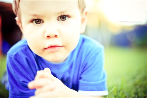
This is the original file as loaded into Lightroom. On a quick side note, learn your Lightroom shortcuts and little tricks, it's very handy for doing these types of posts, and to see where you've come from in your processing. As a standard in my processing, I always start with the Auto-Tone and Punch Presets, then adjust from there. As with all my portrait works, I pulled the clarity slider back to about -20 (-17 here). I also pushed the warm tones, pulled the saturation, and pushed my contrast. I also pushed the exposure slider up to +1.50. This value was dictated by the histogram. I turned on the "Show Clipping" (J) and adjusted until just before his face was blown out. I also added in a vignette.
I then employed a system of colour pushing that I've worked out. It's quite simple really, in the Color tab of the HSL/Color/Grayscale panel push the saturation to about +20 and the luminance to about -20. I skip the reds and pinks/purples when doing this, mainly because I find that Canon cameras usually over-saturate this range anyway. Those are just guessing numbers, in reality I'm no where near that specific with it, but those are the values I try to keep it around. In finishing I ran over the pic with the spot removal tool (N), just to clean up the leftover pieces of cake on his face. Which then gives us this image:

After this there was nothing for it but to try a bit of split toning. When I come to something that is going to be a major change from the original I always create a virtual copy of the image and then continue working on that, that way I always have the big stepping stones of my processing workflow.
I put the highlights into the green, and the shadows into the pink/purples, then pushed up the saturation on both till it got to a point where it looked right. Looking back at my settings I also pulled my exposure back to +1, added in some recovery and fill light and pushed my clarity way up. And here is where that got me:

Ok, now here's the important bit. Which is a bit of workflow that I try(and usually end up keeping) on just about every image I put up on flickr. Export your image to photoshop (or GIMP). take the background layer and duplicate it 4 times. You should now have 5 layers exactly the same.
On the top layer, do a High-Pass Filter, with a radius of about 60. Set the layer blend to Soft Light.
On the next layer do a Soft Light layer blend and set the opacity to about 40% (starting point).
On the next layer do a Screen layer blend, and also set the opacity to about 40%.
This is optional and can sometimes help manage a bit of the noise, Gaussian blur this layer to about 40px, keep the Normal layer blend and set the opacity to about 40%.
Play with your opacity sliders and various variables until you get a result that you like. Onto that I added my watermark and a 4px wide black boarder around the image. Save and export/import back into Lightroom.

Then just a small tweak in white balance (warming) and a touch of fill light, and it's done.
And to save you from scrolling up, here's the final image again.
Hope that shed some light on it all for you.
J.P.
No comments:
Post a Comment